

The same department. A clearer priority.
Labor and Economic Opportunity serves many agencies, programs and audiences. Its unemployment homepage must help claimants and employers while remaining part of that larger department. A fair alternative has to carry that responsibility too. Our proposed webpage retains the department header and five navigation categories, the agency breadcrumb, worker and employer routes, resource library, news, services and department footer.
The information that deserved priority
The agency’s October 30 checklist told claimants to complete their tasks before 4:30 p.m. on November 2. It allowed certification that day regardless of the usual assigned time, warned of possible payment delays if the cutoff was missed, and said past weeks could be certified after the replacement system opened, scheduled for November 9 at 8 a.m.
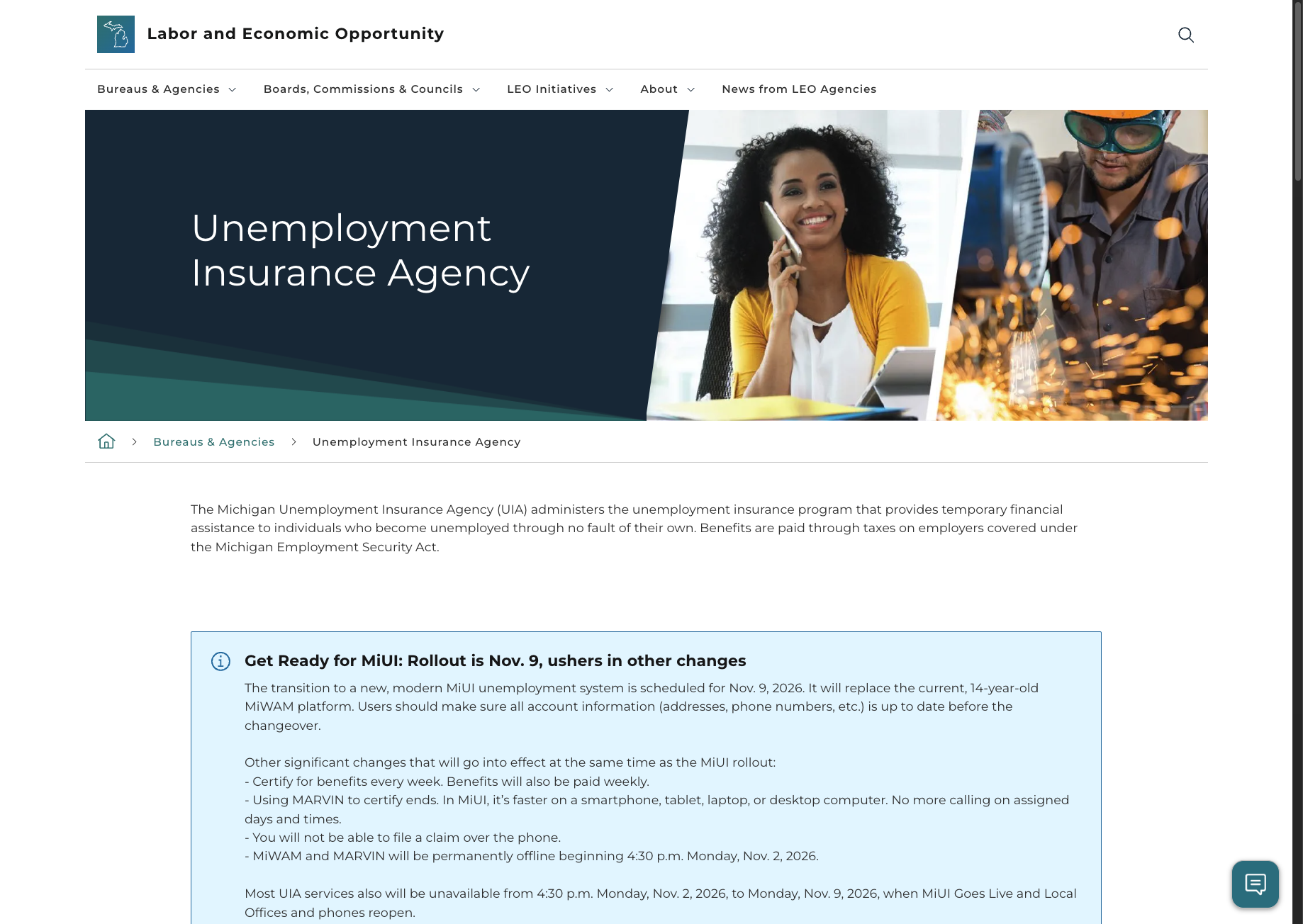
The notice visible in the supplied screenshot gave the closing time without those two crucial details: the assigned-day exception and the possible payment consequence. The wider page links to the checklist. The issue is whether someone under pressure should have to find another resource to assemble the immediate instruction.
Put the action and consequence together.
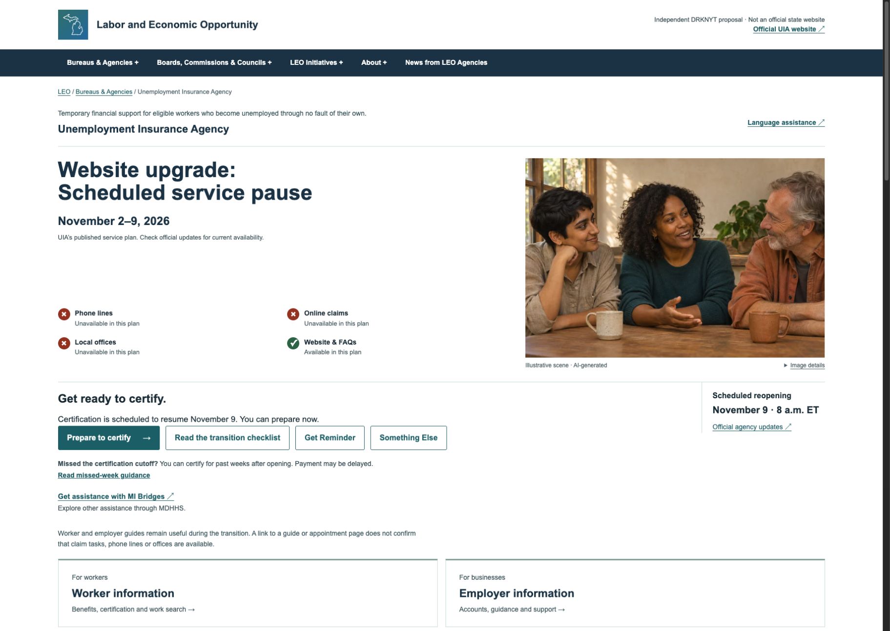
For the historical pre-cutoff view, we put certification, the date and time, the scheduling exception and the possible delay in one place. The checklist and preparation guidance open in dialogs with links to the official sources. Certification happens through the official agency service.
Explain availability as the situation changes.
During the scheduled outage, distinguish paused claim tasks from information resources that remain available. After the planned opening, require official confirmation before implying that service has resumed. Phone certification, phone claim filing and customer-service phone support are separate activities; ending the first two does not mean all phone support ends.
Give different visitors a clear route.
A person receiving benefits and an employer have different tasks. Label those paths directly, explain unfamiliar terms and make access guidance easy to find. A statement that the new system is faster on digital devices does not answer the needs of someone without reliable internet or confidence using it.
What the imagery teaches before anyone reads a word
The large human image under an unemployment heading starts answering “Who is this service for?” before the instructions do. The supplied banner pairs a woman speaking by phone at a desk with a worker using industrial equipment. Apparent racial and gender cues in the portrait sit beside occupational cues in the other image.
A viewer could associate phone assistance with the woman and industrial work with the other person. Those roles are not established by the photograph: the woman could be a staff member, a claimant or someone working. A Black woman and an industrial worker belong in public-service imagery. Their inclusion is not the problem; a reasonable positive reading is that the banner presents a varied workforce and approachable help.
The design question is what associations the composition invites about race, gender, class and belonging. Someone might recognize themselves, feel outside the picture, or understand unemployment support as something for “other people.” These are possible readings, not measured visitor responses or evidence of the agency’s intent.
Our representation standard asks who acts, who decides, who has expertise and who is repeatedly shown receiving help. Role, context and the wider image collection matter alongside inclusion. A single banner cannot establish a repeated pattern.
The original also gets something valuable right: human presence can make a public agency feel approachable. Removing every person made our earlier proposal clearer but colder. Andrew’s review sharpened the test: preserve that comfort while changing what the image suggests about people. The revised opening pairs the service announcement and next steps with an explicitly illustrative scene of three peers in conversation. No one is assigned the role of official, applicant or person in need. The image supplies warmth; the page supplies control. That is our design judgment, not evidence that a photograph caused a particular visitor to feel excluded.
What the proposal demonstrates
The proposal is a complete agency webpage within the LEO structure. It gives the immediate instruction, consequence and scheduled availability priority, then keeps the wider services and information within reach. Its default and comparison capture use the dated scheduled-outage view, led by the website-upgrade announcement, with smaller preparation guidance, visual service indicators and a warm human scene. The scene is AI-generated and depicts fictional people; it is not a photograph of UIA staff or people receiving benefits. The November 2 pre-cutoff view remains explicitly historical. Visitors can download a calendar file to remind themselves to check the planned reopening, or use “Something Else” to find other official help. Downloading the file does not add it to a calendar. A separate MI Bridges link points to MDHHS for other assistance. The scenario control is in the proposal notes at the foot of the page. It changes the information hierarchy without connecting to an unemployment account.
A clearer page cannot supply a staffed alternative. The agency’s published transition guidance scheduled online claim tasks, claim phone lines and local offices to be unavailable together. That leaves an access problem beyond wording. The proposal makes the gap visible instead of promising help that has not been established.
The original already serves several audiences and links to useful detail: a claimant roadmap, employer support, login and certification guidance, appointments, language assistance and the checklist. We retain those responsibilities. The comparison tests priority and the work imposed on the visitor within a broad public-service page; it does not suggest that the whole site lacks help.
How we would judge a better service
- A person can identify the action, deadline, relevant exception and consequence before acting.
- Available help is distinguished from unavailable tasks, with dates and an owner for updates.
- Entry and recovery routes work after opening is confirmed, including appropriate assistance for people who cannot use the online route.
- The same understanding holds on a phone, with larger text, keyboard use and assistive technology.
Those are acceptance questions for a future service review. This case does not establish actual payment harm, unlawful conduct, agency motives, measured audience reception or accessibility conformance.
Sources and scope
- Michigan Unemployment Insurance Agency homepage · Supplied screenshot preserved unchanged; broader page structure rechecked November 3, 2026.
- Transition downtime checklist · Official publication dated October 30, 2026.
- Overview of the replacement system’s launch · Official transition and access guidance.
- DRKNYT methods and representation principles · Our evaluation framework, not legal standards imposed on Michigan.
Evidence consists of the supplied desktop screenshot, official public guidance and our rendered design study. The original capture time is unknown. We did not inspect a claim, submit a form, test the agency’s chatbot or measure payment outcomes. The screenshots and prototype show design choices; they do not prove that a public service is operating.
Share image details
The 1080 × 1350 share image is a native layout using canonical DRKNYT artwork and typography. Composed in Codex by Lyra, November 2, 2026. No image-generation model was used; exact directing model and reasoning setting were not exposed.